

The WILD Brand Evolution
The AIGA San Francisco chapter had founded the Women in Leadership & Design (WILD) program in 2018. Like many ‘extra-curricular’ activities, it fell dormant during the COVID-19 pandemic. Under the leadership of Rachel Gogel, AIGA SF Board Member and WILD Chair, we set out to re-activate WILD in early 2022. Assembling an ace board of design leaders, the WILD team would engage a new cohort of Bay Area women and non-binary creative professionals.
As we emerged from an unprecedented past two-plus years, we recognized that the context had shifted dramatically — for everyone, everywhere. But importantly to our cause, for women and non-binary gender identifying, for people of color, and for creative and tech workers in the Bay Area. Our routines, our attitudes, our aspirations, and our approaches to work have been impacted in ways that we are still discovering and that will continue for years to come. This momentous transformation called for a complete reimagining of the WILD community and brand.
We started by reconsidering WILD’s purpose and goals — along with how we show up to achieve those goals — to ensure their relevance in this changed world. Envisioning a new paradigm, our mission became to amplify women and non-binary designers’ collective power and visibility. Through our events and content, we mobilize and energize impact in design leadership by focusing our work on connecting, elevating, sharing, and educating designers in our midst. We issued a bold call to action: ‘We’re redesigning leadership, together. Join us!’
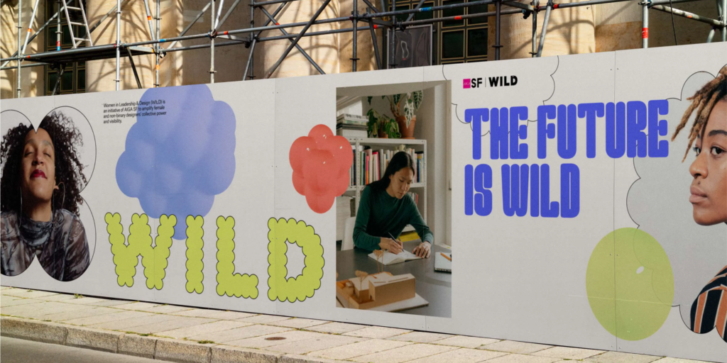
The WILD acronym is so deeply suggestive of our essence, we wanted to emphasize that energy in our expression. Inspired by San Francisco’s history of activism and the spirit of the WILD imperative, our ‘Uplifting Rebellion’ brand platform materialized. We saw an opportunity to drive advocacy across the design leadership landscape. While we’re emboldened and provocative, we balance that with optimism. Our brand must spark joy and positivity even as we seek to tackle the serious, professional concerns of our audience.
We knew we needed to walk our talk. Our identity would reflect a commitment to Bay Area women and non-binary design professionals, while harnessing the energy of the moment. It was imperative for our presence to be evocative and inclusive — and contributed by the group we represent. We were eager to work with a female-owned San Francisco-based studio and as a result, we approached Yung Studio to bring WILD to life. Rachel Gogel elaborates: “When it came time to find a partner to evolve AIGA SF's Women in Leadership & Design brand identity, it was important for us to find a woman-led branding studio in the Bay Area so that we could not only breathe our mission but also reflect the local design community in the work itself. We want WILD to feel relevant, fresh, and dynamic for designers seeking community today — and that's exactly what the Yung Studio team delivered.”
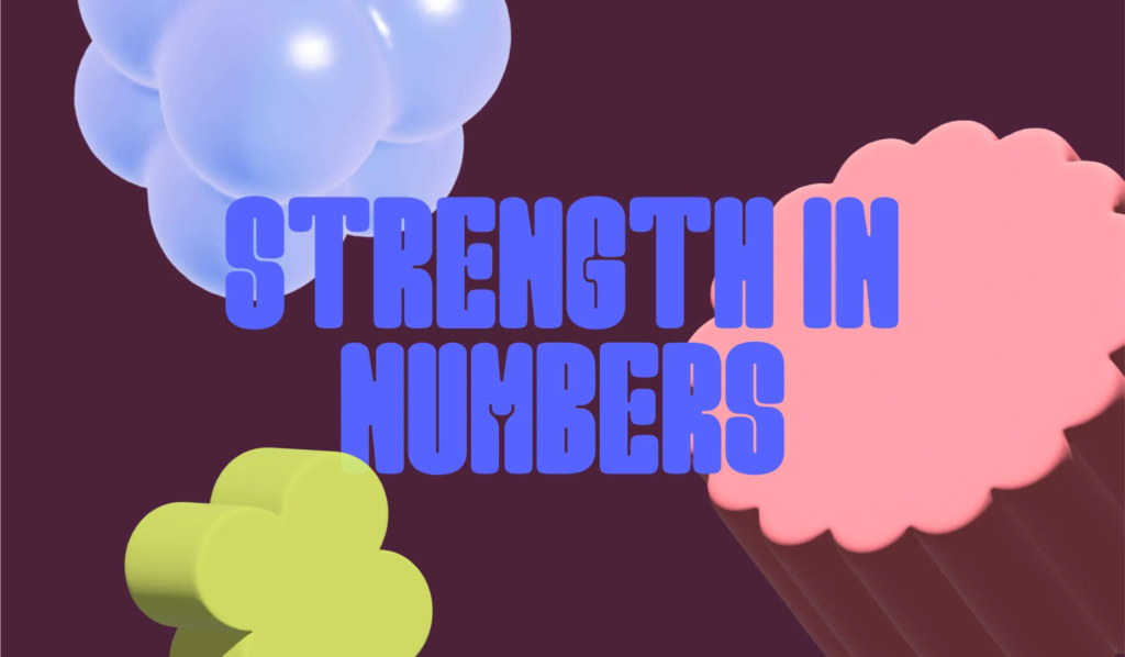
The multidisciplinary design practice, led by Melody Yung, centered the visual language around ‘the power of strength in numbers’ — a concept which is captured through a bubbly design system. At its heart sits a variable wordmark, inspired by the shape of speech bubbles. “By expanding the quantity and volume of the dots,” Yung explains, “the intent was to emphasize the power of strength by collective conversations.”
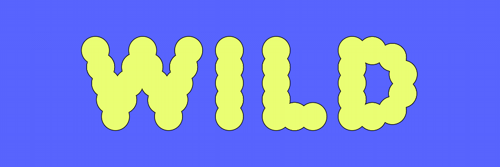
The accompanying typefaces harmonize the key brand elements and were both created or co-created by women designers. The clear Atlas Grotesk family brings optimism and functional legibility. Meanwhile, Marion Bisserier’s wonderfully loud, compact, and bold display typeface Good Girl captures the ‘bubbly’ nature of the identity while delivering defiant playfulness. Likewise, a floating shape system includes ‘collective dots’ and harnesses the idea of a continuously growing and shifting collective.
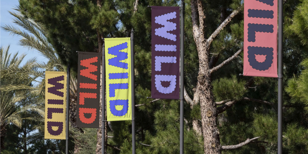
The strength in numbers direction was one of three initial options presented to the WILD team. And like any good client, we loved all three of them! We felt challenged to choose just one concept, so in the proud tradition of brand leaders everywhere we combined elements from the alternates. One of the key components that we remixed was a unique color palette.
To reinforce an energized ethos, and avoid any reductive or overtly gendered symbols, the team opted to combine bright electric hues alongside warm and earthy tones. It was important to “make sure the brand is as gender neutral as possible since we are speaking to both women and non-binary designers,” Yung reveals. By bringing some welcome weirdness to the identity’s color and shape direction, we sought to “smash the duality of tech and human, a constant tension as a design consideration, especially in the San Francisco Bay Area.”
The partnership with Yung Studio generated a distinctive visual perspective and activated engagement with the community. Plus it was just simply fun! Gogel explains, “I appreciate their commitment to this project since the work was executed after standard business hours. They were quick, very receptive to feedback, and were able to develop a lot of brand assets in a short amount of time. I would highly recommend them to any organization looking to reimagine their look and feel in a unique way. Also, the fact that this collaborative effort brought together an all-women team was just amazing.”
Now that we’ve convened the team, captured the visual and voice expression, and activated the community, we’re officially relaunching the Women in Leadership & Design program. We’re sharing a pipeline of exciting content and events. And we’re just getting started! We hope to continue to expand the group to serve our mission of amplifying designer’s collective power. So what’s next? Perhaps the ongoing contributions from our crowd of design leaders (yes, that’s you) will make all the difference. We’ll say it again: “We’re redesigning leadership, together. Join us!”
____Acknowledgements:
WILD 2022 Leads Rachel Gogel, Marta Guy, and Felicia Reyes drove the brand evolution. Betina Bethlem conceived the Uplifting Rebellion brand platform, and Sarah Beldo further developed it with our voice guidelines. Check out more of our creative partner’s work at Yung Studio. And read the case study. The team of designers included Melody Yung, Helen Ip, and Brandi Steele. Our typefaces are Good Girl by Marion Bisserier and Atlas Grotesk by Commercial Type. This article is adapted and expanded from a feature in The–Brand Identity. We’re incredibly grateful for the recent attention we’ve received for the brand redesign. Keep it coming! Specifically recognizing the following press: