

Original artwork by Tomer Maimoni
Back in 1711 Alexander Pope wrote: “To err is human; to forgive divine”. Much has changed in the last 300 years, but people (and for that matter, apps, servers, and networks) definitely still “err” on a fairly regular basis.
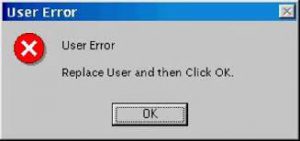
Yet, sadly, it’s still fairly common for software developers, testers, and support desks to disregard certain reported problems because they are deemed to be a result of “user error”. You’ll even hear people defend a piece of software by using the old line that “it’s working as designed” — as if this settles the matter!
But isn’t all software created for people? In which case, if someone is using it and encounters a problem, surely we shouldn’t be so quick to simply blame the user? Wouldn’t it be more helpful if instead, we considered how to improve the software so that fewer people encountered similar problems in the future?
One of many similar memes. Funny…except for when you are the user who encounters a problem.
In truth, no product in existence can claim a 0% user error rate, even ones designed with considerable thought. No matter how simple and usable your product is deemed to be, invariably some users will encounter error scenarios. And in the enterprise software environment, so-called “user errors” can have a huge impact on efficiency, staff morale, and costs.
The practice of designing for different potential user errors can be a stressful one. As designers, we are hopefully self-aware enough to recognize that we have biases. However, this doesn’t always stop us from drifting into an idealized realm where everything we design is naturally understood, where everything works as it should, and where the primary use case of our product is followed to a T. Plus, if we’re being totally honest with ourselves, sometimes we do have a lack of empathy for novice users, the under-prepared and the impatient. And even when we are being as empathetic as we can, we can still sometimes end up getting it wrong.
However, it’s worth remembering that the issue isn’t always about how to prevent errors, so much as how to accommodate them. That is, perhaps aiming to create an airtight product, completely free from any possible user error is ill-advised. After all, the humble pencil is a brilliant design, not because it prevents user errors, but because it assumes them. In fact, you could even say that it encourages them.

Create, correct, create, correct, create, correct…
Don Norman may have said it best in his landmark book The Design of Everyday Things
“The designer shouldn’t think of a simple dichotomy between errors and correct behavior; rather, the entire interaction should be treated as a cooperative endeavor between person and machine, one in which misconceptions can arise on either side.”
Norman proceeds to give much useful advice on this “cooperative endeavor between person and machine”. I have summarized some of these key principles below.
Like the old maxim that “there are no dumb questions,” so too, there are no dumb errors. Each error can be seen as a user asking the question: How do I accomplish this task? and the product giving them a wrong (or at least insufficient) answer. It’s what Norman calls a “gulf of execution” — the difference between the intentions of the user and the allowable actions of the product. Through every iteration of a product, the designer should look for new ways to narrow this gap.
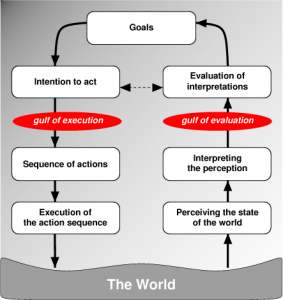
The Gulf of Execution and the Gulf of Evaluation. Source: https://www.w3.org/People/Bos/DesignGuide/simplicity.html
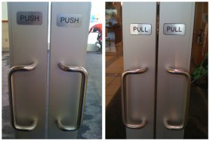
An example: This is simply bad door design (and no amount of signage can cover this fact) because the pull handles are understandably interpreted by the casual user as suggesting that the door should be pulled. (Source: http://finalmile.in/behaviourarchitecture/affordances-designing-for-action)
On the other side of things is what Norman labels the “gulf of evaluation”. Normal defines this as:
“the amount of effort that the person must exert to interpret the physical state of the system and to determine how well the expectations and intentions have been met.”
Designers should always strive to make a product easy to evaluate and understand, but this is especially true in the case of error scenarios. When a user tries to do something and is unable to, they should not have to struggle to figure out why. Users don’t want to expend effort learning about why something went wrong, but they also don’t want the problem to keep happening. Therefore it’s part of the designer’s job to help the user understand the issue — as quickly and painlessly as possible — and how to avoid it occurring again in the future.
As an example, the spellcheck tool in early word processors was a great invention, but it became even better when editing environments automatically started to underline likely mistakes in real time as the user typed.

Modern text editing tools, including Grammarly shown here, helpfully identify potential issues (by underlining them in the text) and provide the user with likely “fixes” to these issues.
Think of the speed bump. That’s what error messages between a user and a product should feel like: they should make you aware of a problem (e.g. speeding) and also help you to correct the undesirable behavior (e.g. by forcing you to slow down).
For more serious problems, however, you should make it harder for users to encounter the issue in the first place. For example, leaving your bank card behind at an ATM machine could lead to serious problems for the user, so cash machines have been designed to eject the user’s bank card before dispensing any cash, thus avoiding the scenario whereby a user might otherwise take their cash and walk away before collecting their card.
Never assume something is easy to understand without testing it. Never assume mistakes happen one at a time. Some of the worst disasters in history have occurred when everything that could go wrong did go wrong. Likewise, never assume users won’t see a crisis and proceed to make it worse.
Lastly, don’t assume you can think of all the ways in which a user will encounter or generate errors. Conducting well thought-through user research at each stage of development is a good way to test a broad sample of error scenarios — and to discover ones that you’d never previously envisioned.
Arin Bhowmick (@arinbhowmick) is Vice President, Design at IBM based in San Francisco, California. The above article is personal and does not necessarily represent IBM’s positions, strategies or opinions.