

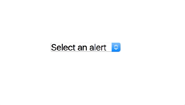
The importance of designing for error states often gets pushed to the back burner. After all, no one enjoys planning for errors—we’re all perfect, right? Yet that little error state message that pops up when you accidentally forget to check that box or type an i instead of an o, actually raises the level of cortisol in your brain. In layman's terms, it physically stresses you out.
A lot of error messages can be confrontational or even insulting to the user, which only pushes us further into a semi-panicked state. What if designers took a different approach and made such moments more human and conversational; what if they took into account the fact that we’re not robots and we get stressed out by sounds, words and mistakes.

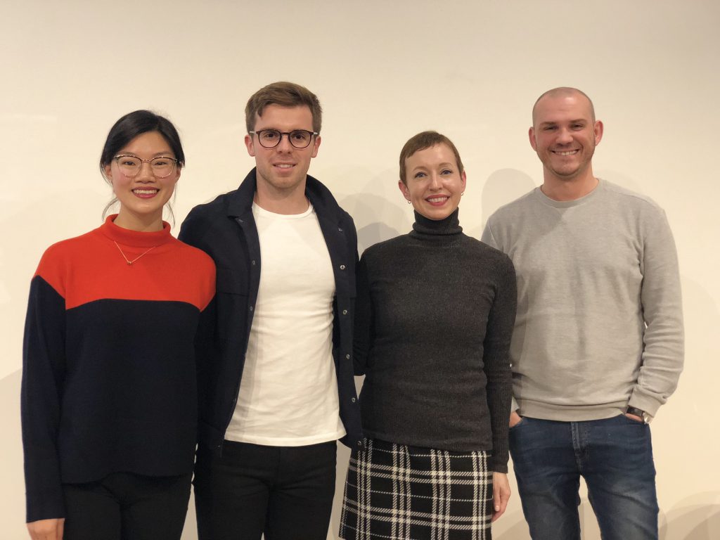
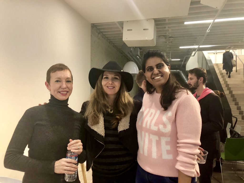
Last week we gathered at Zendesk to discuss Designing for Errors and Edge Cases. We were joined by panelists Christy Yang (UX Design, Google), Tomas Brennessl (Product Design, Facebook), and Lukas Bugla (Experience Design, Adobe). Andrea Drugay (UX Writer, Dropbox) the moderator for the panel, questioned the panelists on everything from what exactly is an error, what’s a good error message and what is the worst type of error messaging.
Below are a few of our key takeaways
1. An error state can be a teaching moment. Keep the tone simple, delightful and most of all, human. The action should be conversational as if you are talking to a friend, without being overly technical. Help your user learn how to avoid the issue in the future and keep it lighthearted.
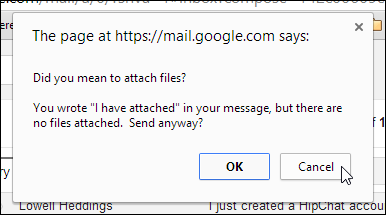
2. Everyone likes an escape plan. Integrating an undo feature or asking a question to get to the bottom of an error goes a long way. Having a slight delay such as Caviar allows the user a chance to backtrack and get it right. Or how about all those times that gmail has had your back.
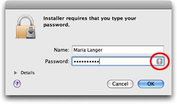
3. Preventative UI will go a long way. Adding the Caps Lock icon, like Apple did, was a super simple fix to something that had all of us banging our heads against our desk when we knew we had typed in the right password.
4. Be aware of the ethical component to errors. There is a big responsibility on a design end when working within certain products. Take the responsibility that Waze has over ensuring users aren’t driving and typing or the users of the Hawaii Emergency Management system. Before an error occurs give your user a warning, provide some guidance. Create interface friction.
5. Never leave anything empty. An empty state as an error message can be the perfect opportunity to guide people. Follow it up with a question “Do you speak another main language?” or “Did you mean?”. Instead of leaving it blank, help get the user to where they want to be.
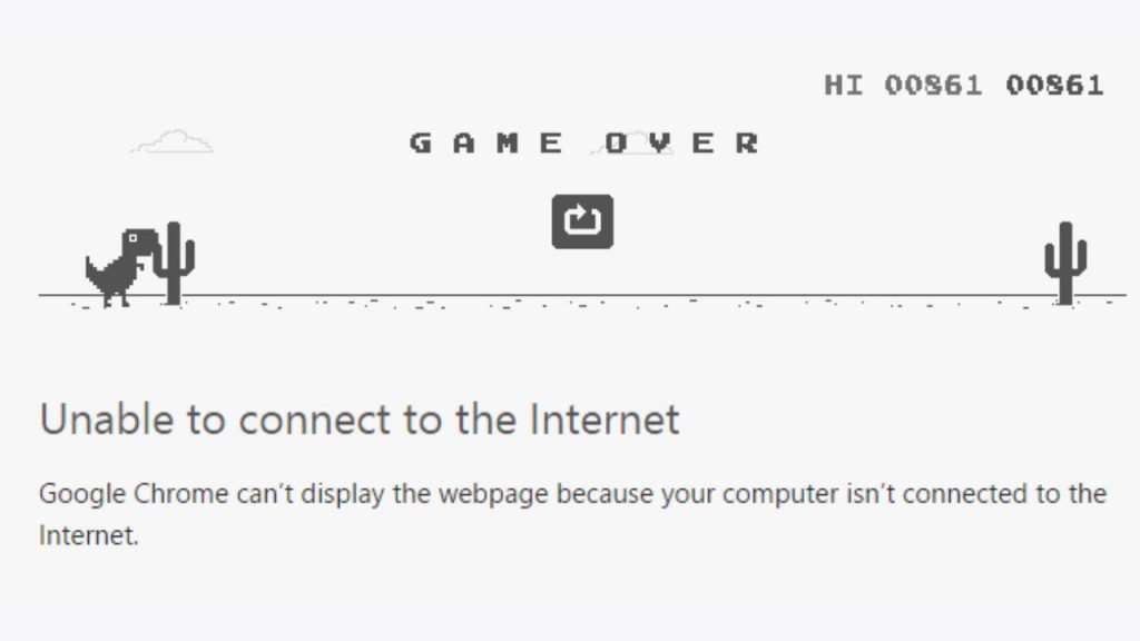
6. Clever isn’t the way to go. Our experts don’t recommend being funny or clever. While there is the rare case when it works, “jokey” isn’t the best approach. We asked our expert panelists if they can think of a time when it ever works, they responded with the infamous google dinosaur.
A big thank you to all our panelists, moderator and AIGA SF board members, Irina Blok and Miki Setlur for organizing this event! Thank you to Zendesk and Jilanna Wilson for hosting. See all of our upcoming events here.
Zendesk builds software for better customer relationships. It empowers organizations to improve customer engagement and better understand their customers. Zendesk products are easy to use and implement. They give organizations the flexibility to move quickly, focus on innovation, and scale with their growth.