
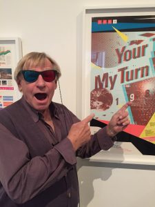
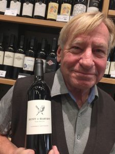
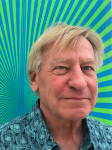
Design, teach and practice.
If you refer to Tom Ingalls as a respected colleague and true friend, take a number. You are in this club along with designers from Los Angeles, San Francisco, and New York, foodies from the finest kitchens, gardens and restaurants, Buddhist practitioners along the California Coast, and elite golfers around the world.
He and I first met in the late ’80s at a design conference in Park City, Utah. I was just starting out, but Tom’s career trajectory was already in the stratosphere of West Coast Modernism. He always had a bright smile and a charming quick wit. His skiing style was fearless and freewheeling.
Forty years later, Tom is still a high-energy character whose typography remains restrained, classical and sublime. And he’s still unapologetically analog in a digitally obsessed world.
Tom truly represents a seasoned graphic design practitioner with unconditional love: for his students, the community of designers, and for the challenges that have shaped him. Just as in his wild youth, he’s always been positive and optimistic about our field and makes cultivating community a priority in all facets of his life.
I invite you to get to know Tom by reading this interview we had in early 2020. And, if you think you already know him, you may be surprised when you read on. I’ve known him for over 40 years and had no idea of the complexity of his experiences. Enjoy.
— Petrula Vrontikis

Petrula Vrontikis: Tell us about your start as a designer.
Tom Ingalls: My first job out of grad school was as a staff designer at LACMA (Los Angeles County Museum of Art). I had the right skillset. I had just gotten my MFA from CalArts. Lou Danziger was a consultant to the museum at the time. We worked together for three and a half years.
PV: And what was the most valuable thing that Lou taught you?
Tom: Really good picture layout. Every month I had to do this calendar and I just got a stack of photographs and some copy. Lou had already designed the format, so it was really a safe place to practice catalog layout. I had been trained well by Sheila de Bretteville at CalArts. My work developed a kind of Lou/Sheila style: less is more, good typefaces, and simple text design.
I was 30 at that time and living in Los Angeles. So, it was inevitable that I was influenced by April Greiman. “Southern California Swiss” was really emerging, I kinda jumped on that wave. I don’t think I was a trendy person. It was just what was happening. When it’s happening, you don’t realize that you are actually making it happen. You just feel like that’s just what’s going on.
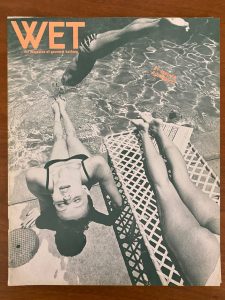
In the late ’70s, WET Magazine came up and I started working on it, I also worked on Archetype Magazine, and on other publications. What we now call the New Wave movement was just modern graphic design to us at that time.
PV: Your taste in typography is absolutely exquisite. If you were to credit the people that you’ve learned the most from about type, who would they be?
Tom: Roger Black. He opened me up to the world of display type and also the understanding of historical properties of mixing typefaces. We really went deep into their origins and their place in history. He was a newspaper designer and then magazine designer. He could use type as an expression—particularly decorative type. He hired me as an art director for Los Angeles Magazine and then he got hired at Rolling Stone. When Roger was made art director there, he hired me again. That’s how I came to San Francisco.
PV: Tell me more about your time at CalArts.
Tom: Sheila Levrant de Bretteville was my teacher for my Master’s thesis. She was my main teacher, and then I worked for her during the summer. She was trained at Yale in a beautiful classical Armin Hoffman, Paul Rand style. She had a really good sense of classic readable typography with a Modernist flair. But, she’s also a feminist, and a woman, so she had a beautiful, elegant mixture of soft and hard, big and expressive. She taught me about contrast and how typefaces could really tell their own story just by their appearance— how you could express emotive thoughts using type as the design element.
I learned a lot from my classmates. We all worked together. Joe Malloy and Greg Thomas were kind of the yin and yang at the time. Greg being the Kansas City Helvetica guy and Joe being the beautiful text type guy. Joe really understood texture of type and classical typefaces. Greg was sort of an aggressive modernist, a kind of Kansas City modernism.
I developed more of a classicist approach, but I think every designer brings a particular skillset to the table. Even though, the common denominator is graphic design, some of us are better writers, some are better illustrators, some are better thinkers, some are better colorists. I’m kind of the classic, yearbook layout guy.
PV: Describe your design path through the vibrant decades of design in the ’80s and ’90s in California.
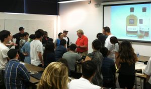
Tom: To me, the ’80s were about refining the New Wave tendencies and the ’90s were about applying them more to current graphic design. The emergence of the Macintosh happened in the middle ’80s and that influence started early in Northern California. The high-tech Apple wave was starting to crescendo as these companies began dominating the market. That’s when I moved up to San Francisco and opened my studio in 1980. I got involved with beverage-based clients because the wine and spirits industry was also becoming big in Northern California.
PV: Were you an early adopter or late adopter of technology to practice your craft?
Tom: I got into the technology when it got good enough for me to use it. 1985 was the watershed year for the Apple II. The problem for me before then was that both page layout software and digital typography were pretty bad. If designers were going to become typesetters, we needed better tools. When we started getting Adobe software and better digital type design, we could control the typography. All that said, my design is not technologically driven at all. Still, my favorite tools are colored pencils, tissue paper, and the Xerox machine.
PV: What about imagery? You have such a wonderful aesthetic sense. Who were your influences, or is that just part of who you are?
Tom: Like a lot of designers I liked photography. Photography was the gateway drug into design. I liked the collage aspect that images and text created. Back then, Warhol was very influential to me-both the idea of appropriating imagery and that art could be more interesting as multiples.
I always wanted to be an artist, but didn’t think I had the temperament. Graphic design was an outlet where I could be a graphic artist. It allowed me that artistic sensibility. I’d say both Andy Warhol and Frank Stella were major influences. I loved to see color in geometry. Also, Rauschenberg and Lichtenstein, John Cage, and Merce Cunningham. Those were the people who were making the art back then.
PV: While you were working at LACMA, did you ever have conversations with any of them?
Tom: No, but the people hanging around were Robert Irwin, Sol LeWitt, Ed Ruscha and Billy Al Bengston. They were in the museum constantly.
PV: Tom, that’s just astonishing.
Tom: Yeah, and David Hockney, I went to his first show at the Corcoran Gallery, the swimming pool boy painting. The boy was underwater in the pool, with a guy looking in. I saw that show. At the time, it sold for the most money of any modern painting. And the Gemini G.E.L. art gallery had just started.
PV: Let’s jump to today. How do you describe your practice today?
Tom: We are a relatively small design studio based in South of Market, in Potrero Hill. We design books and catalogs, branding, including web and collateral. We design a lot of point of purchase materials for the interior design industry, textile samples and swatches. Our wine, spirits and beer packaging are the most visible projects commercially.
Much of what we do is actually graphic design, but we’re really good at managing all the rest, from a production standpoint to working with vendors. We consistently provide good service, so our relationships with clients often last years— sometimes even decades.
PV: Let’s talk about your packaging and branding for wine, spirits and beer. Why has that become your specialization?
Tom: I always kept pursuing that because I enjoyed the work and I enjoyed the people. Wine is a food product. These people are growers of an agricultural product. They care about the fine details of growing and fermenting grapes. They care about what kind of wood they use for the barrels, what kind of paper they use on the labels, what kind of flavors are involved, and what kind of food it goes with.
It’s sensual and it’s fancy, not unlike the process of a designer choosing beautiful colors and foils. It’s three dimensional. It’s more like fashion and why I like to choose good clothes and fabrics. You’re dealing with foil paper, glass, cork, wrapping boxes, enclosures, wood, all that materialization that I love. I love seeing how ink, color, and those materials express themselves.
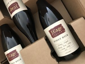
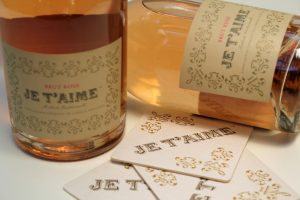
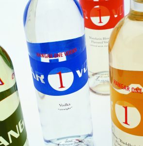
My first wine client was Tony Cartlidge and he said, “Tom, this bottle that we’re designing has to look good in the wine shop, amongst all the other bottles. But when you take it home and you’ve got nice candlelight going, and you’ve got a beautiful plate of food, and you’re looking at your friends…when it’s the only thing left on the table, it’s also got to look beautiful then too.” I call it the winemaker’s promise: the label is an invitation to an experience.
PV: You are a killer chef and you love cooking. Is there anything about the process of cooking that parallels your process of design?
Tom: They are absolutely the same. You think about what you want to do, you come up with a theme and you find the best ingredients that are available. Then it’s about planning, organizing, and creating a menu. There’s the process: procedure, measurements, with the right amount of this versus the right amount of that. You have to orchestrate it, time it, and then deliver it.
The first time you make it, it’s pretty good. The second time you make it, it should be a little bit better. And the third time you should have found that play. So, I would say to young graphic designers: “If you want to be a good graphic designer, you should learn how to cook.”
PV: When did you start teaching and what were the circumstances around you starting to teach?
Tom: Around 1979, both Michael Vanderbyl and Michael Manwaring were teaching graphic design at CCA(C). The student body was starting to grow, so they needed more teachers. They saw my book design and catalog design as driving a more typographic study. They asked me to lunch and ended up saying “Hey, we really need some new people to start teaching typography, would you be interested?” That was the spring. I started the next fall.
PV: What is the most wonderful thing about teaching?
Tom: It provides me with an ongoing and very satisfying connection to the school and to the other faculty. For example, today, I had breakfast with Eric Heiman, then saw David Meckel at school, and then ran into Jennifer Sonderby. These are real people that I respect. You get to know them outside of their profession, unlike how you would know them as competitors in the field.
Another great thing is learning to be a better teacher through the students and seeing their success. They are part of our family, so we have that sort of unconditional love for them and want them to succeed.
PV: How is your teaching different today than it was in the ’80s or ’90s?
Tom: I don’t think you get to be a good teacher except by teaching. In the last 10 years, I think I have really become a good teacher. Now I trust what I’m saying. I’m confident in my methodology and I’ve learned how to get people to learn for themselves. I’ve learned how to get inside their heads. Also, my articulation has gotten much better talking about design.
PV: How has that happened? As a person, how have you matured into being so comfortable in your own skin?
Tom: Well, I think it’s that Malcolm Gladwell saying about mastery: it’s about putting in the 10,000 hours. I don’t think there’s anything that can replace that.
PV: Well, sometimes people get stale. I believe that over the years, you’ve always been a rich person, meaning rich in your talent, rich in your generosity, but somehow you gotten richer as a person. How has that happened?
Tom: I don’t know. I think I’ve done a lot of personal work too. It’s led to an integration of Tom as a person and Tom as a professional. I’ve always had a good expressive hungry mind, and am interested in knowing more and learning more. I’m kind of a seeker. And what I found makes me feel less of an imposter and more the person that I really am. So, it’s becoming the person you were meant to be.
PV: You have an ongoing meditation practice, how does it influence either your teaching or your design work?
Tom: My mind is sort of hyper and I have mild ADD, so my thoughts go a little faster than what I’m doing; so I’m not capturing everything. Meditation helped me slow down, it’s helped me pay attention, and it’s helped me be comfortable in that “not knowing” place, where instead of listening to someone talk and thinking about how I want to respond, I’m just listening. I’m no longer trying to jump ahead of the story. I’m trying to really absorb what’s going on and I give myself permission to think it through first. It’s called Upaya: skillful means.
Integrating listening and compassion with right activity and right thought works with clients. I like getting out and selling design and being social—but that’s not every designer.
PV: I agree. That community part is important, and I think it’s admirable in regards to the entire San Francisco design community. How does San Francisco as a city influence how you approach design?
Tom: I think the city has influenced me because it has attracted a certain kind of person or designer. It’s a place where immigrants and freethinkers feel more comfortable. It’s an open, friendly design community.
PV: If you were to practice design in any other city in the world, where would that be?
Tom: New York, if I were younger. I’d love to have worked in Chicago, maybe in my mid-career. I love Minneapolis, where I grew up. I could have very much stayed there—that’s a great design community. I’ve worked in LA and enjoyed college there, so I would feel comfortable to go back to LA and work. And, other cities… maybe London.
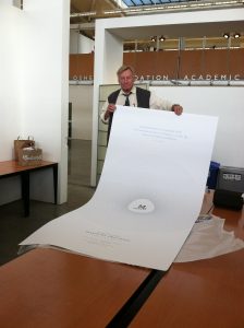
PV: Tell me about the genesis of your publishing company, Missing Links Press.
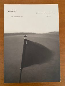
Tom: I originally wanted to do a golf book on a famous golf course architect. And out of the research, I found a lot of missing links. There were a lot of golf holes that had been covered over when new freeways were built. For example, when Highway 280 came in, they had to cut the corner of a golf course. So, they turned the golf course around, changed some of the holes, added a new hole. If you look at golf course plans from the ’20s and ’30s and compare them with today, there are missing links, they were the missing holes.
I tried to sell this book idea to a British publisher. He didn’t want to publish it, but he said he would distribute it. When I came back to San Francisco, I saw that someone had published a similar book that made my book not worth publishing. They did an amazing job on this architect and all of his golf courses. So I just let the project go.
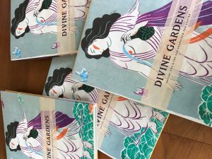
I had bought the URL missinglinkspress.com, and I was paying for it for a few years. Finally got a letter saying I either had to pay another $200 or I couldn’t own the domain anymore. I either need to publish something or let it go. By that time the term “missing links” had become ubiquitous on the internet. It was a nice twist of fate that this was not just about golf anymore, but about links between ideas and images. I saw it as an opportunity to start doing projects that connected interesting ideas with interesting artists.
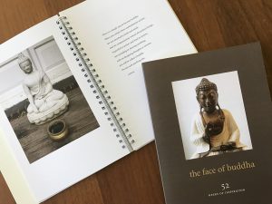
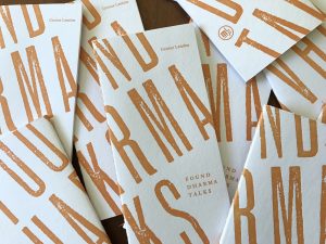
I felt like the art of poetry with the art and the literature of Buddhism was a really good place for me to start. It was something I was interested in and something I had been studying. The work at Missing Links Press could be a combination of my design, my spiritual practice, and truly doing something that meant something to me.
PV: What’s the value of the AIGA to you, and what’s its value to younger designers?
Tom: Through the AIGA, I feel part of something that’s bigger than me, but includes me. I’ve been a member since the early ’70s and I value being able to spend time with my peers and connect to the larger Bay Area creative community. As I have gotten older, I want to hear what younger designers are thinking.
Younger designers often volunteer on AIGA committees for programs and exhibitions. They can show their dedication and skills to the more established designers. This connection often results in work opportunities.
In 2009 I was given the Fellows Award from the AIGA San Francisco chapter. I was honored and humbled that my colleagues thought of me. I suppose being in service to the design community as long as I have accumulated a lot of good karma points.
PV: Any final thoughts or advice?
Tom: My mantra is design, teach and practice.
Nurture the things you are interested in by practicing in quick rigorous ways—like I did early on with publication design. I got to see my work come back every week, learn from my successes and failures, then do it all over again.
Teaching provides great feedback for you to see what you say and know what you get back from students when you say it. You learn to be more specific about what works and what doesn’t. Teaching helped me become a better designer and creative director.
Running my own studio has been a lot of work, but it’s been luxurious experience. I don’t see my life and work as separate. I mingle them together by pursuing work in the things I love to do.
Tom’s shortlist of inspirations and loves:
3 Sans Serif Fonts
News Gothic
Univers
Benton Sans
3 Serif Fonts
Caslon
Sabon
Granjon
3 Happy Color Combinations
Warm sand and light rust orange
Purple and purple
Cool black and warm grey
3 Favorite Golf Courses
Aberdovey Golf Club, Gwynned, Wales
Royal Dornach, Dornach, Scotland
Old Head, near Kinsale, County Cork, Ireland
3 Cheeses
Fromager d’Affinois from France. (It’s butter disguised as cheese.)
Mt Tam from Cowgirl Creamery
Cana de Cabra from Spain
If I could be anyone else ever, I’d be Dainin Katagiri Roshi, born in Osaka, Japan (1928–1990). He came to San Francisco to help Suzuki Roshi establish the SF Zen Center in 1969–1971, before Shunryu Suzuki died. He went on to establish Minnesota Zen Center on Lake Calhoun, four blocks from my first home in Minneapolis, Minnesota. Also, because I asked my teacher for help with patience, she named me after him. Dainin means great patience. He wrote two great books and gave many important dharma talks. I never met him but feel close to him and his teachings. I visit that temple whenever I visit Minnesota.
::::::::::::::::::::::::::::::::::
Petrula Vrontikis is a professor at ArtCenter College of Design, teaching graphic design, career development, and professional practice courses. She encourages students to explore their potential as designers and as a catalyst for change in the larger creative community.
Petrula’s current work includes research, writing, consulting, presentation skills training, and career coaching. She received an AIGA Fellows Award honoring her as an essential voice raising the understanding of design within the industry and among the business and cultural communities. She also served as a national advisory board member of the AIGA.
Petrula is an avid traveler and visual translator. It’s not unusual to find her scuba diving with giant manta rays, climbing a steep and rocky slope, or twisting her body like a pretzel in a yoga class.