

Even if you don’t know Jean François Porchez’s work directly, his award-winning typefaces have likely permeated some part of your life. His clients include Beyoncé, Nespresso, Louis Vuitton, The Paris Métro, The Boston Globe, to name a few. In preparation for his visit to AIGA in San Francisco in October, we asked him some questions about what it’s like to be obsessed with arranging the written language for a living.
Is there any particular moment or experience that influenced your choice to be a typography designer?
Immediately I discovered that we can draw an infinite quantity of letters, using very simple tools, using only black and white. I was fascinated. Back in 1987, in my earlier years at graphic design school, I quickly came to this pragmatic conclusion: as a lot of students in my class wanted to work as an illustrator, graphic designer, or art director, nobody showed any interest in typography; I thought I’d get very few competitors in this small type industry, so it would be much easier to achieve something in the future. I must confess that I was already fully into letterform design at the time, so I tried to convince myself of this [sic] deliberate choice of an area that wasn’t so clear to me.
If you had to state three essential qualities of design, what would they be?
1. The counters and white space — from architecture, to posters, web page, letterforms — should always be perfectly designed.
2. Your design should always looks simple, easily reproduced.
3. Stay humble, (graphic) designers can’t change the world alone.
Who is your greatest mentor or influencer?
Ladislas Mandel, a french typeface designer who made a lot of ultra legible telephone directory typefaces for many countries (including the US), targeting 3-points text size. His designs combined a very clear vision of the function, without ignoring the cultural differences.
(I wrote his obituary in Le Monde… sorry in french only)
What are some of the differences between [graphic] design in France vs. the U.S.?
Not based on any scientifical approach, I have the feeling that the difference between the average lawyer and the average graphic designer’s income is less important in the USA than in France. Or perhaps it’s just that designers are more considered helpful [sic] for anyone who starts a business? Based on my trips and discussions, the graphic designer income looks to be higher in the USA. I tend to think that income is an indicator of the healthiness of the graphic design industry. The way in which society thinks design can add value to every human activity. Last but not least, it [seems] easier to sell fonts to graphic designers in USA compared to France.

What motivates you other than design?
I haven’t realized until very recently, that building bridges between humans is something that I do all the time. It’s a strong motivation every day of my life, since my first September as a professional teacher at a design school, to joining a non-profit organisation in my field very quickly. These days, following my ATypI presidency, I dedicate some of my time to the Club des directeurs artistiques in Paris. Beside Typofonderie and ZeCraft, and the master’s degree in Typographic design that I manage in Paris, we’ve also launched TypeParis summer course as well— workshops, talks and so on. It’s a platform to share knowledge, to discover people, to learn from others.
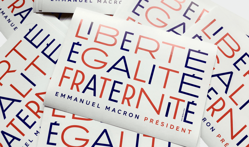
Less directly related to my professional activities, because of Brexit and the Trump election, I decided to do something for my country, other than voting and complaining after the election as usual. So, I’m like all these french who for the first time of their life embraced political activities. We made Emmanuel Macron our president! He is like your Kennedy or your Obama for us. En Marche! movement who was born in April 2016 and is now a party. We stand together to help the transformation of our country. In early 2017, I was asked to contribute to the Emmanuel Macron campaign with a piece of typographic design.
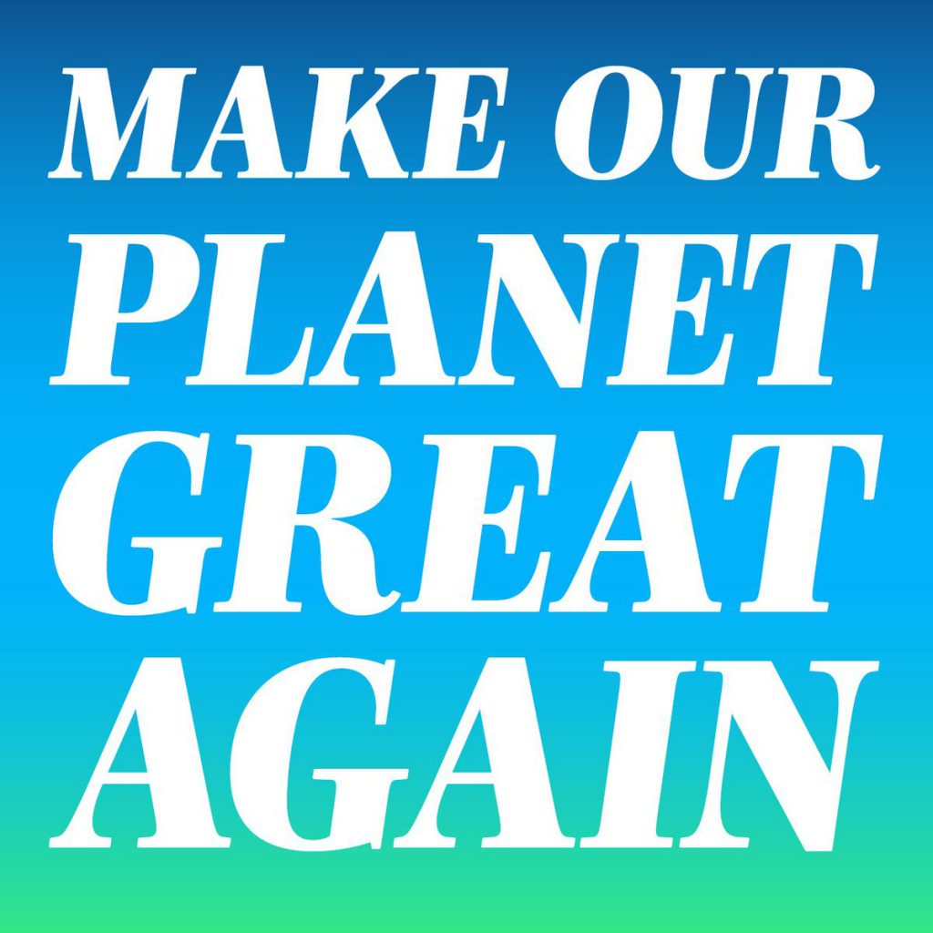
Later, Emmanuel Macron started to use my Mencken typeface at last month's campaign as well for his early days as president. The biggest tweet of the french history “Make our planet great again” is set in Mencken.
And since the last few weeks, the three official typefaces of Palais de Élysée (our White House) and Emmanuel Macron are Typofonderie typefaces. Indeed, locally, I give my time everyday to the activities En Marche!
What is your favorite font?
That’s the typical question to ask a typeface designer! I don’t have a favorite, or [my] favorite changes all the time. In the past, it was the historical Garamond (the models found on books printed by Estienne and so on). These days, PS Fournier designed by Stéphane Elbaz is my t favorite, because it’s a very smart revival, well designed from a less used source: Pierre Simon Fournier. Also because Fournier types echo the French revolution and widely used a the time. Compared to Garamond, which I consider a royalist typeface (Garamond grecs du Roi ordered by the king of France), Fournier is very much the typeface of the people. When I met with the newly appointed creative director of Palais de Élysée during the summer 2017, I pointed out this comparison. It looks obvious to me that the shapes of the language of a president should reflect himself.[sic] Typography can’t change the world, but it [can be part of] the transformation of a country.
What are you working on right now?
We’re on the last stage of the Ysans typeface, our next launch at Typofonderie. The Ysans is a sans-serif influenced by Cassandre lettering pieces and the geometric sans-serif style from the inter-war period. Since [the] Chanel logo, the geometric sans-serif style is the favorite typographic thing in fashion when it’s not Didot-Bodoni style.
Ysans asserts this reference. Nevertheless, Ysans takes its sources from logotype Yves Saint Laurent (1961…) and to the pointed finish and endings, the references to the Roman capitals engraved and unique features such as the open R or other details from Adolphe Mouron Cassandre’s post-war graphic work. Certain letters from the Ysans are directly a homage to the Cassandre work on Yves Saint Laurent logo, the R, the narrow U, the apex of the N, and all the details of such pointed endings on the f and t lowercases.
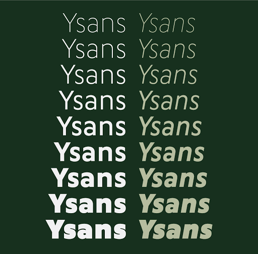
In fact Ysans project started in 2011 at ZeCraft as a typeface designed specifically for Yves Saint Laurent Beauty still in use by the brand under its original name: Singulier. In the end, the Ysans is like fashion as envisaged by Yves Saint Laurent who constantly revealed multiple references in his new collections, without it being possible to recognize at the end anything other than his unique style. "Fashions pass, style is eternal. Fashion is futile, not style."